As workplace design has become more visible — photographed, shared, and celebrated online — it’s also become more performative.
That visibility has pushed aesthetics forward in meaningful ways. But it’s also created a gap between how offices look and how they actually function once people move in.
Because offices don’t stay frozen in their opening-week glow. They get used. By humans.
…With laptops, backpacks, opinions, bad posture, and a remarkable ability to find the one weak point in any design.
So let’s look at the most common mistakes aesthetics-focused offices make, how those mistakes cause real-world failure over time, and the simple solutions for a space that looks great AND doesn’t frustrate the humans working inside it.
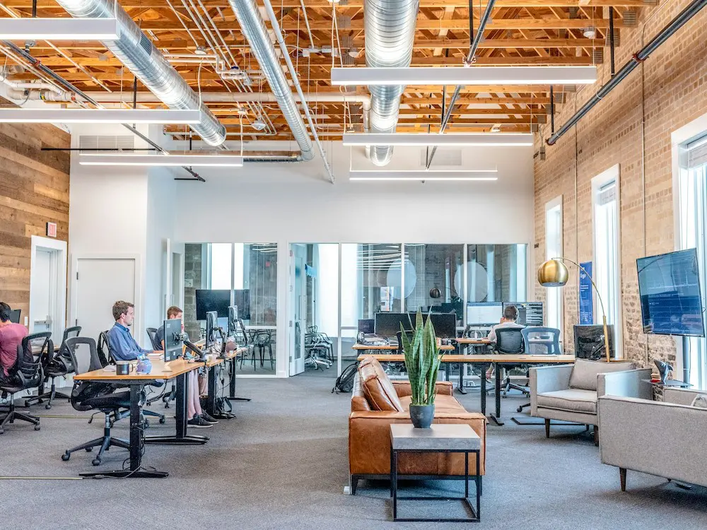
Designing for launch day instead of year three

Many offices are designed to peak on opening day.
Materials may look pristine and statement elements might land exactly as intended. But once daily use begins, those same elements often reveal their weaknesses…
Surfaces wear quickly. Custom features become difficult to maintain. Replacement cycles weren’t fully considered.
Design that only works when it’s new isn’t durable design; it’s staging.
Why this fails in practice
Offices are high-touch, high-traffic environments. When durability and maintenance aren’t prioritized early, even the most beautiful spaces degrade faster than expected, increasing costs and frustration.
What works instead
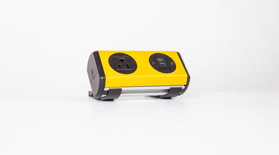
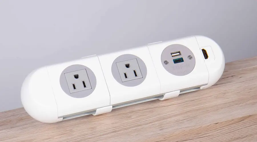
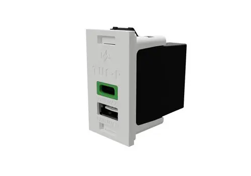
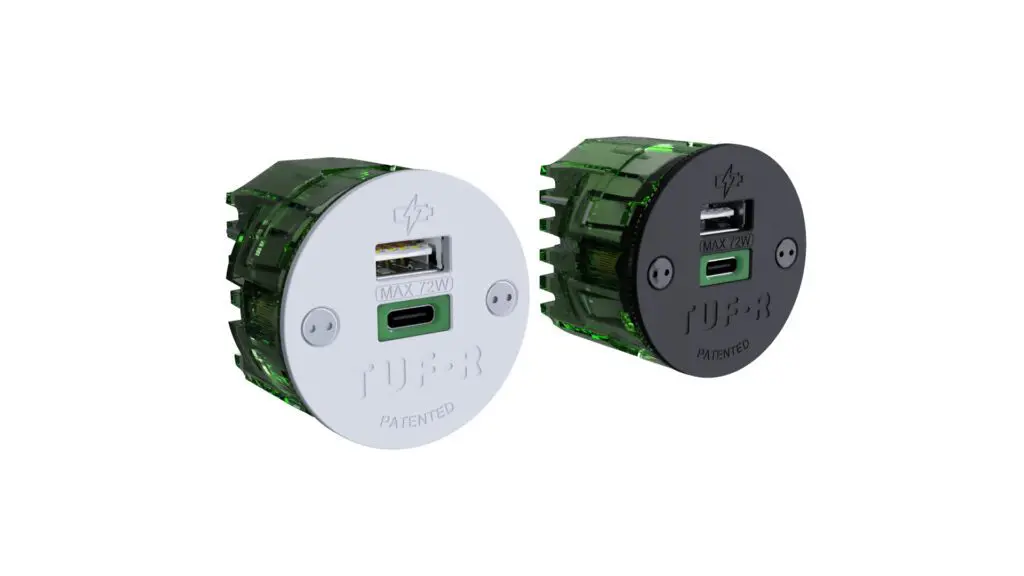
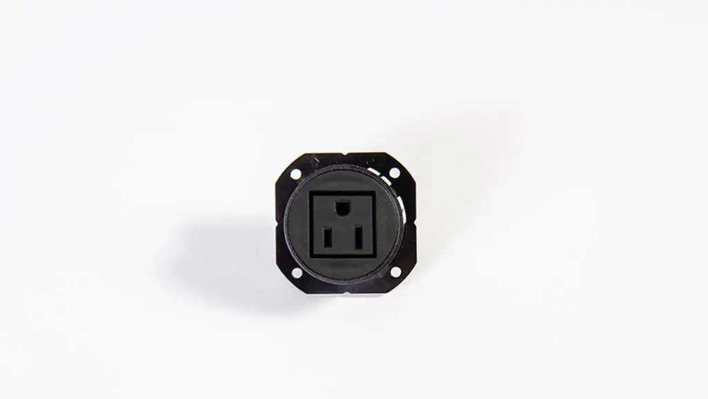
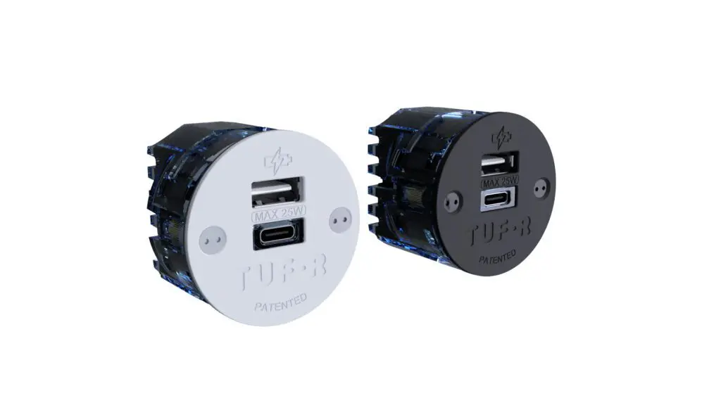
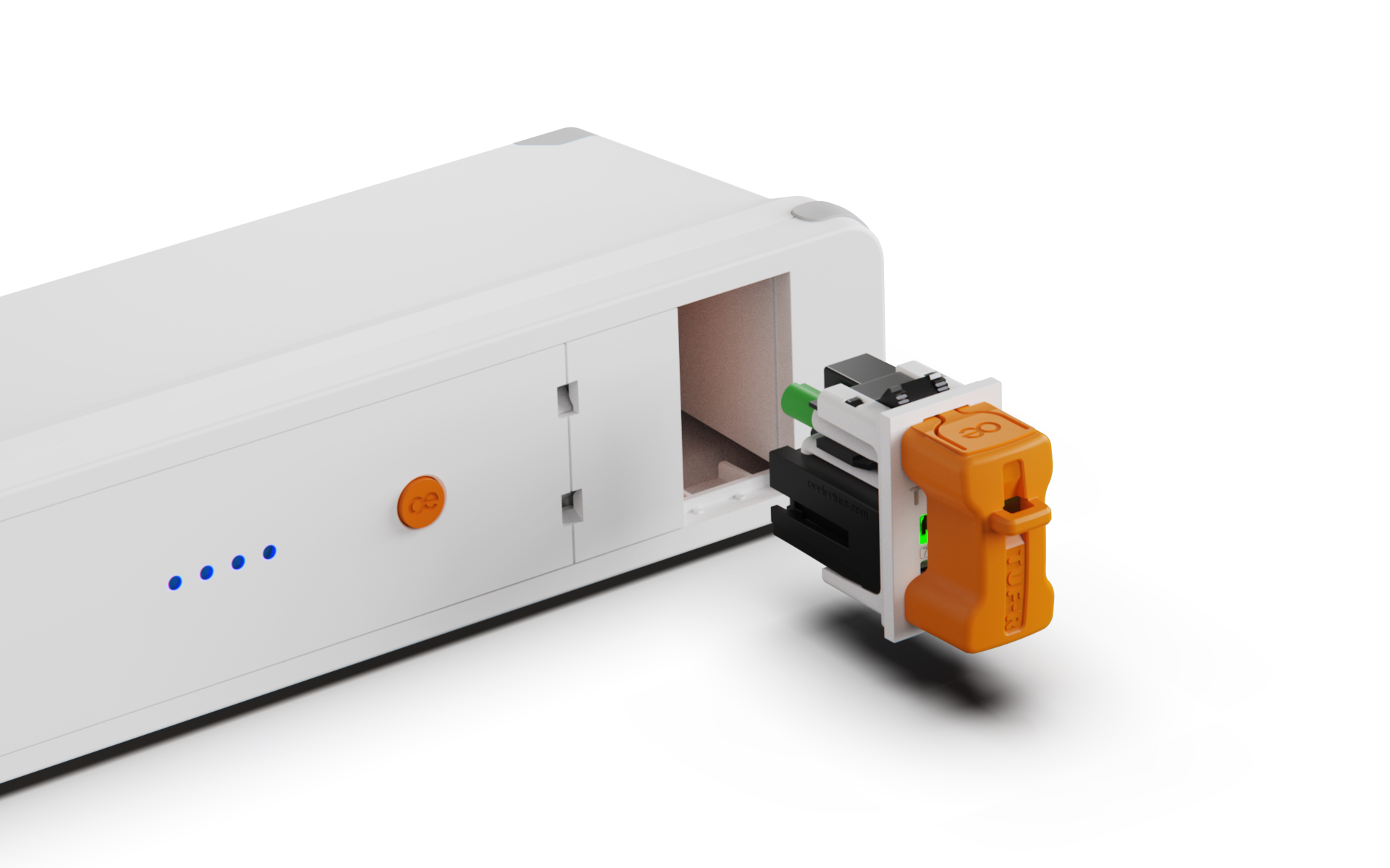
Design for longevity first, aesthetics second. Choose materials that age well, components that can be repaired individually (why hello, TUF-R® replaceable USB ports!), and finishes that tolerate real use. If something can’t survive year three without special care, it probably doesn’t belong in a workplace.
Confusing openness with collaboration

Open layouts are often justified as collaboration tools. In practice, openness alone rarely delivers collaboration, and can often undermine focus.
In digging into online forums during our research, we found that open-plan offices are actually one of the most complained-about features, with hostility shown towards the leadership that choose them.
Like this user on Reddit:
“When our company went to open office floor structure our director decided he would work on the floor as well. Within a month he was back in his corner office”.
Without acoustic strategy, visual openness tends to produce constant background noise, interruptions, and cognitive fatigue. People adapt by avoiding shared spaces, wearing headphones, or defaulting to digital communication.
Why this fails in practice
Collaboration doesn’t emerge from proximity alone. It requires the right balance of connection and separation. When that balance is missing, productivity drops and informal collaboration actually decreases.
What works instead
Design collaboration as a choice, not a constant. Balance open areas with acoustically protected spaces, and give people real options for focused work. Collaboration works best when it’s intentional, not unavoidable.
Furniture that looks inviting but discourages use
Aesthetic-driven furniture choices often prioritize form over comfort.
The result is lounges that look welcoming but don’t support real work, seating people don’t stay in for long, and spaces that remain underused despite prime placement.
Why this fails in practice
If furniture doesn’t support the way people actually work — laptops, calls, longer dwell times — the space becomes decorative rather than functional.
What works instead
Test furniture the way people truly use it. Prioritize ergonomics, durability, and comfort over novelty. If a chair can’t support a working session, it’s décor, not furniture.
Treating flexibility as a visual concept
Many offices appear flexible without being truly adaptable.
Furniture may be technically movable, but heavy or awkward. Layouts suggest agility, but infrastructure is fixed. Reconfiguration becomes expensive, disruptive, or simply avoided.
Why this fails in practice
When flexibility exists only at the surface, spaces can’t evolve with teams, workstyles, or organizational change. What was meant to be adaptable quickly becomes rigid.
What works instead
Build flexibility into systems, not just layouts. Modular furniture, adaptable infrastructure, and thoughtfully placed services allow spaces to evolve without major disruption.
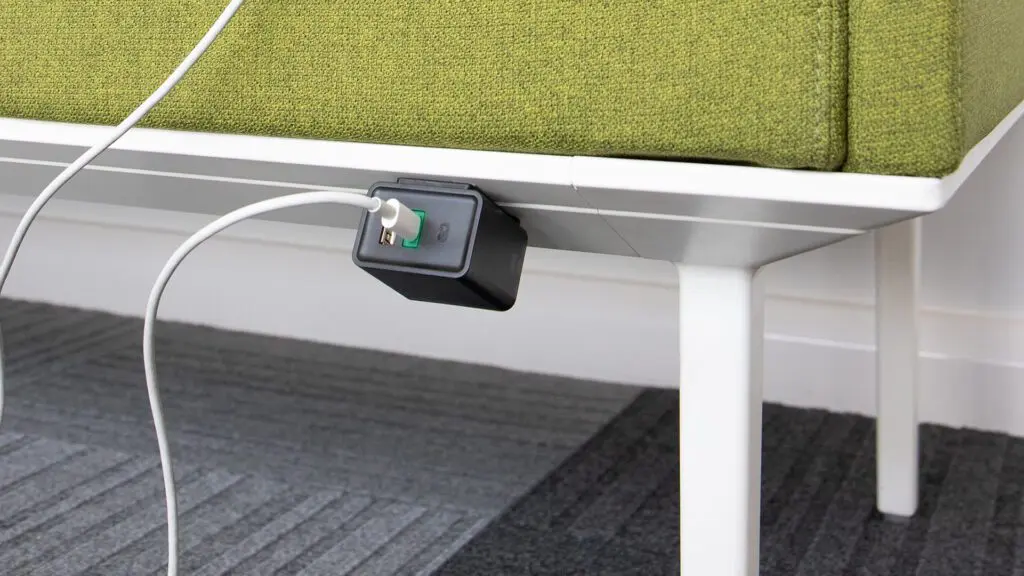
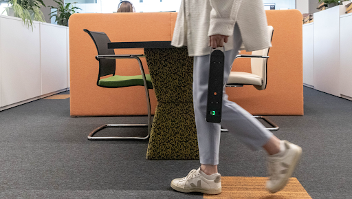
And don’t forget about flexible tech…
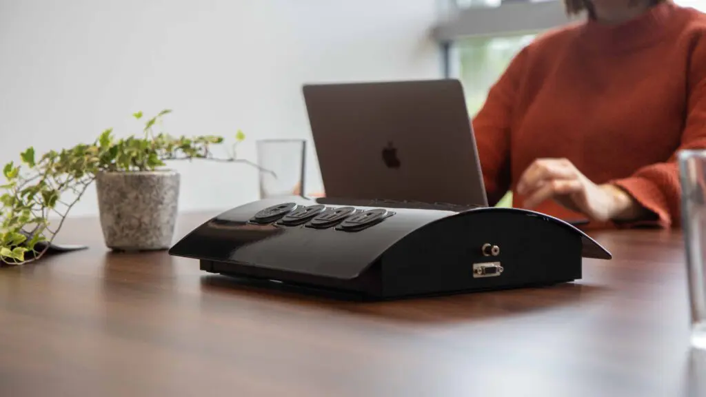
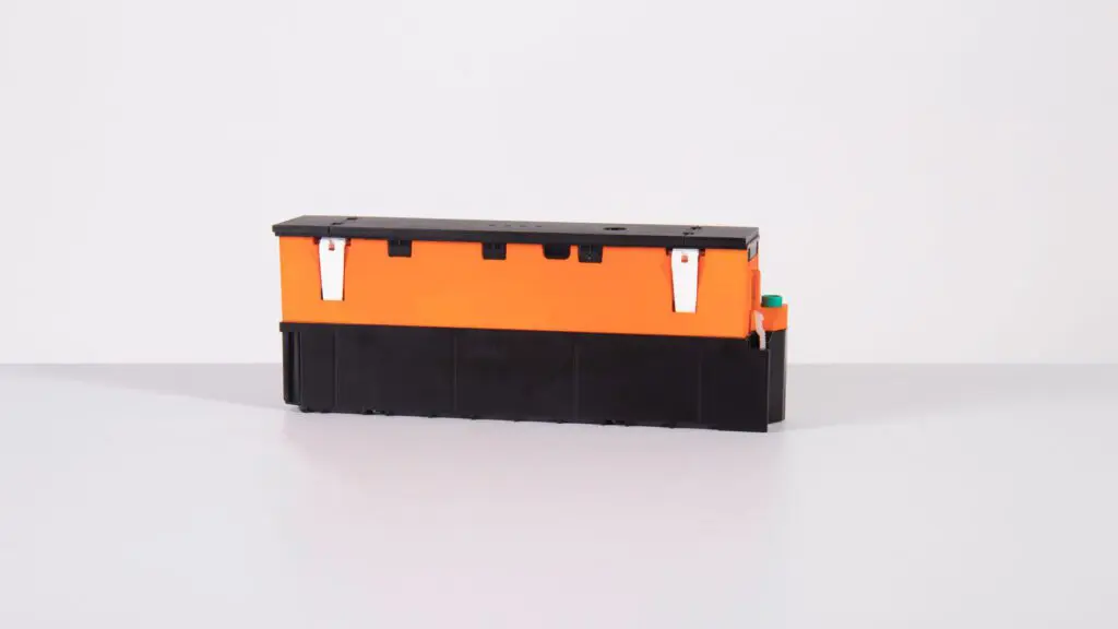
Products like our mobile Animate™ battery line allow users to take portable power anywhere in the room, which opens up every space in your office (even outdoors) as a “functional workspace”.
Forgetting about maintenance and operations
Design decisions don’t end at handover.
Materials that are difficult to clean, bespoke elements with long lead times, and fragile finishes all increase operational burden. Over time, this accelerates wear and raises costs.

Why this fails in practice
Spaces that are hard to maintain degrade faster, regardless of original design quality. What looked refined at launch often becomes visibly tired within a few years.
What works instead
Design with maintenance in mind. Choose materials that clean easily, components that can be serviced without specialist tools, and systems designed for routine access. A space that’s easy to maintain stays beautiful longer.
Designing for one type of worker
Not everyone thrives in the same environment.
Offices that assume constant collaboration, high stimulation, or uniform work patterns often exclude people who need quiet, structure, or lower sensory input.
As one user on OSMI put it:
“I work best in silence and with minimal distractions, but the best I can do here is to put on headphones and white noise and hope I’m not distracted, although I ultimately will be.”
Why this fails in practice
When spaces don’t support diverse work styles, people disengage, avoid certain areas, or struggle to perform at their best.
What works instead
Design for choice. Provide a mix of quiet zones, collaborative spaces, and restorative areas so people can match their environment to their task and energy level. One office should support many workstyles.
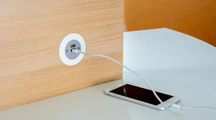
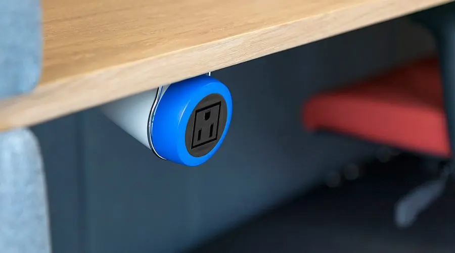
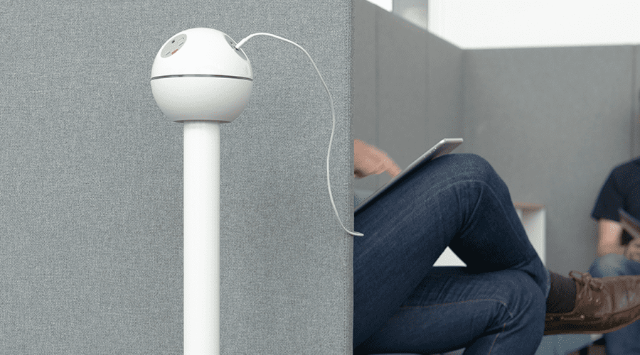
And don’t forget to account for power here…
Any quiet zones or private workspaces should include ample power options. Otherwise they will quickly become expensive, unused pretty features.
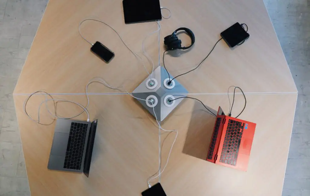
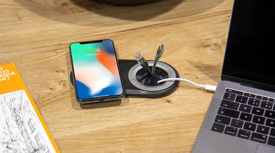
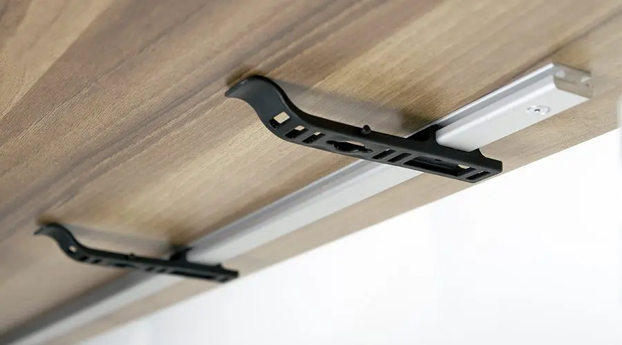
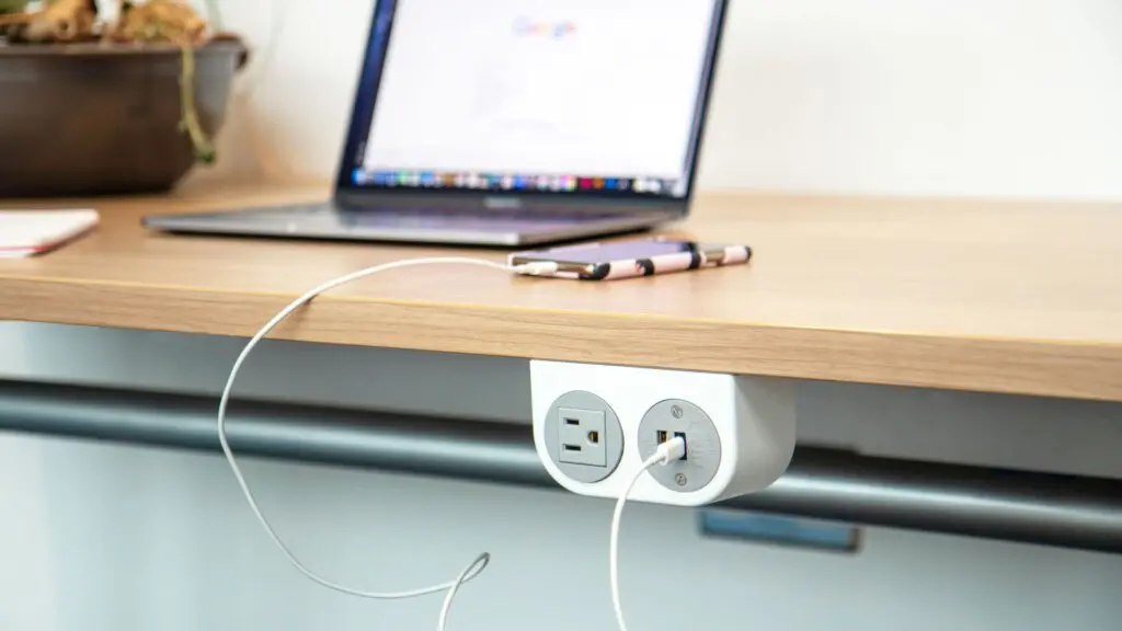
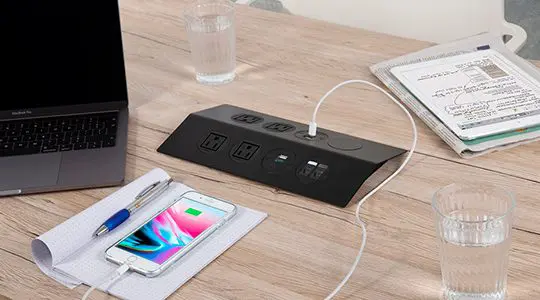
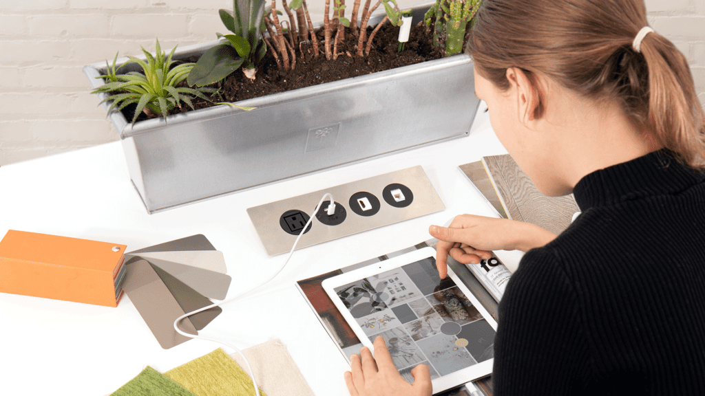
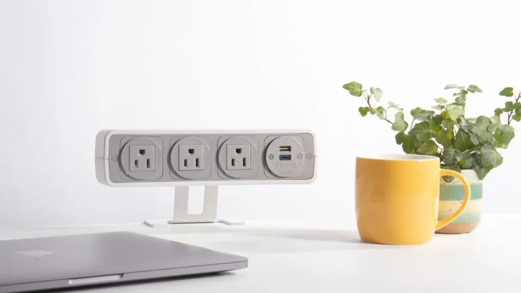
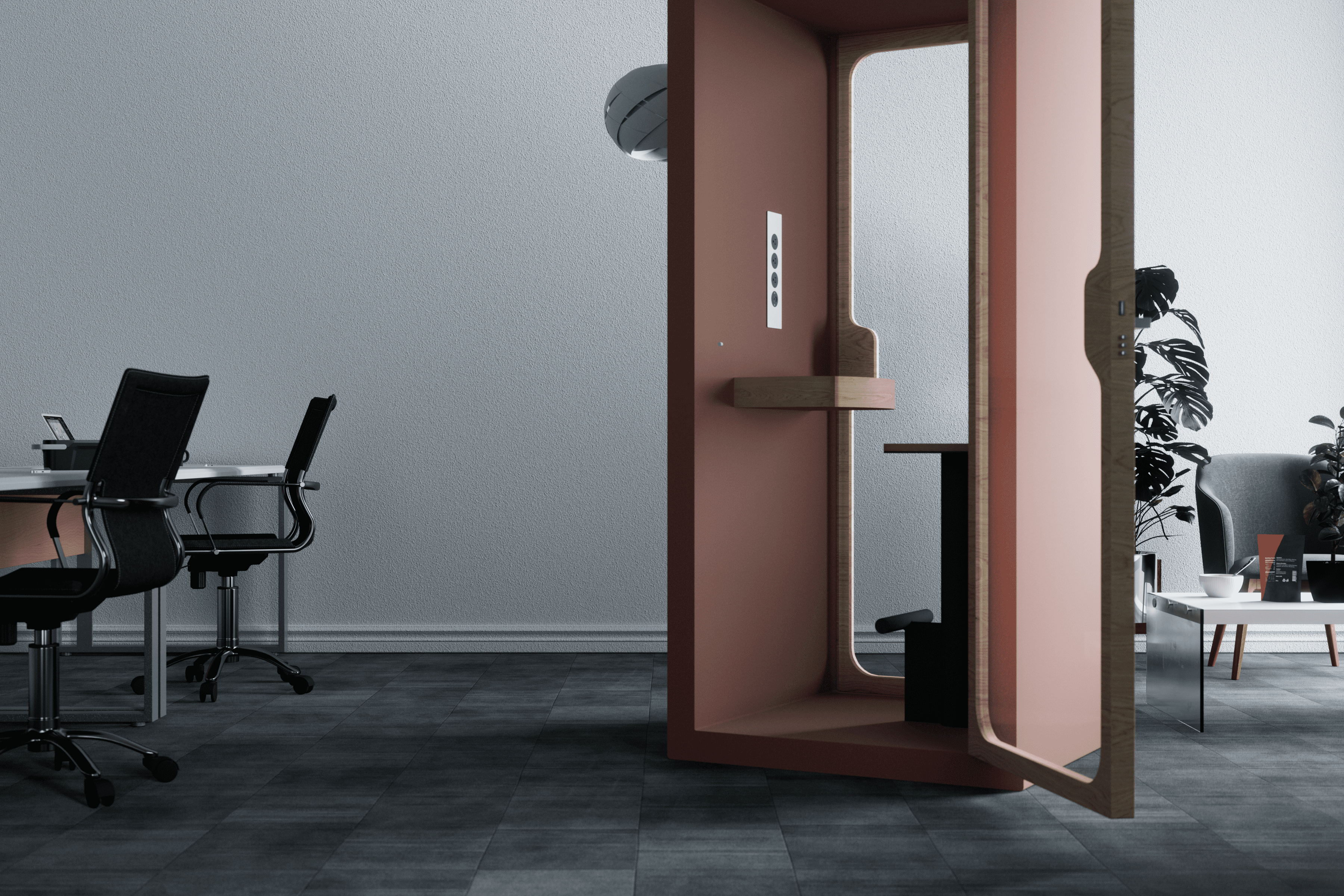
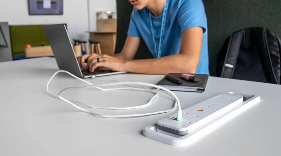
Adding technology after the design is “done”
When technology is treated as an accessory rather than infrastructure, it shows.
Visible cables, awkward adapters, and improvised power access disrupt both aesthetics and usability. Over time, these workarounds multiply.
Why this fails in practice
Technology dictates how people use space. When it’s bolted on later, it introduces friction, safety risks, and visual clutter.
What works instead
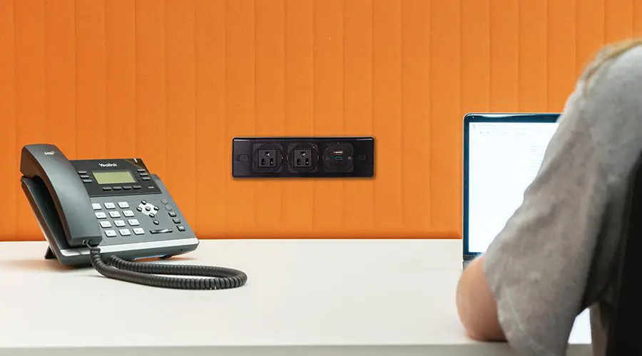
Integrate technology early. Power, data, and charging should be designed into furniture and architecture so they support behavior instead of interrupting it.
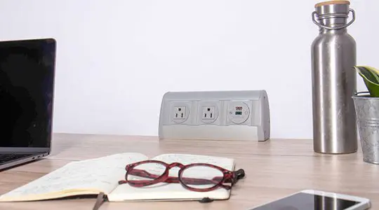
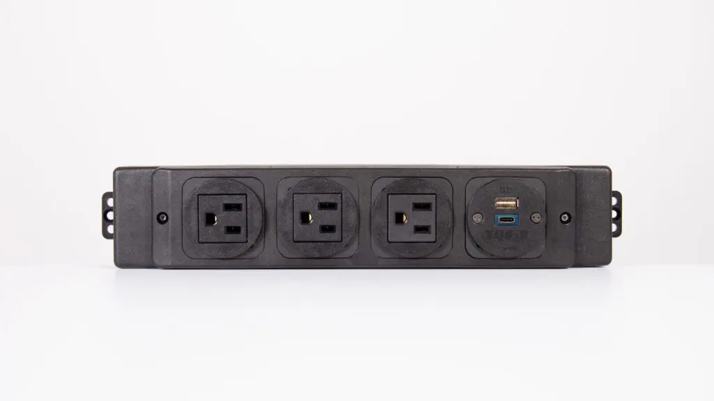
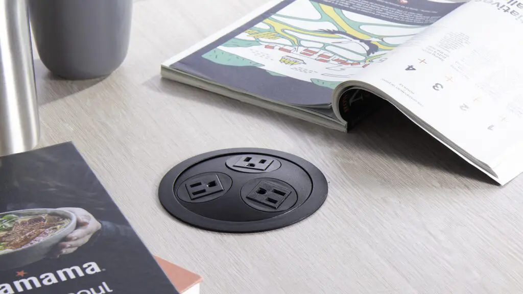
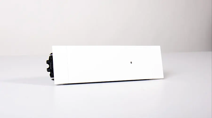
OE’s got you covered here. Explore our line of in-surface charging units that can be installed into furniture for a clean, user-friendly design.
Sustainability that stops at the surface
We’ve talked about our skepticism of many sustainability claims before, and the beautiful office is no exception.
Here’s the problem:
In an aesthetic-based office, sustainability is often expressed visually: greenery, reclaimed materials, eco-friendly finishes. And they may look great…
But when spaces require frequent redesign to keep up with trends, or disposal/replacement due to breakage, those surface choices are quickly undermined and the space fails to be “green” long-term.
(Like this story about UC Davis, when they had to throw away 200 nearly-new competitor units 🙈😭 …before they bought our Panda desktop chargers.)
Why this fails in practice
Short lifespans negate sustainable intent. Replacing entire systems because small components fail creates unnecessary waste and cost. And keeping up with the Joneses’ style means throwing out loads of perfectly usable elements.
What works instead
Design for longevity and repair.
From a design perspective, go with timeless style and finishes if sustainability matters to you. “Beautiful” doesn’t have to match everyone else’s trend du jour. You’ll sleep better knowing you won’t be throwing away loads of trend-based pieces next year.
And favor practical systems that can be maintained, upgraded, or partially replaced. The most sustainable office is often the one that doesn’t need redesigning every few years.
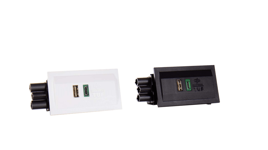
That’s the ethos behind our TUF-R® range of fully replaceable USB ports. If the USB charging component inside fails, you can pop out the small unit and replace it with a new one, in about 30 seconds flat. Which is loads easier and cheaper than buying a whole new unit…and loads greener than throwing away and replacing entirely.
Beautiful offices don’t fail because they care about aesthetics…
They fail when aesthetics are treated as the goal instead of the outcome.
The offices that succeed over time share a common trait: they remove friction, anticipate real use, and age with dignity.
When the space still feels usable long after the ribbon-cutting — after chairs have been scooted, layouts tweaked, and the novelty has well and truly worn off — then congratulations. You didn’t just design a beautiful office.
You designed one that people actually want to work in.
Which, last I checked, was rather the point.